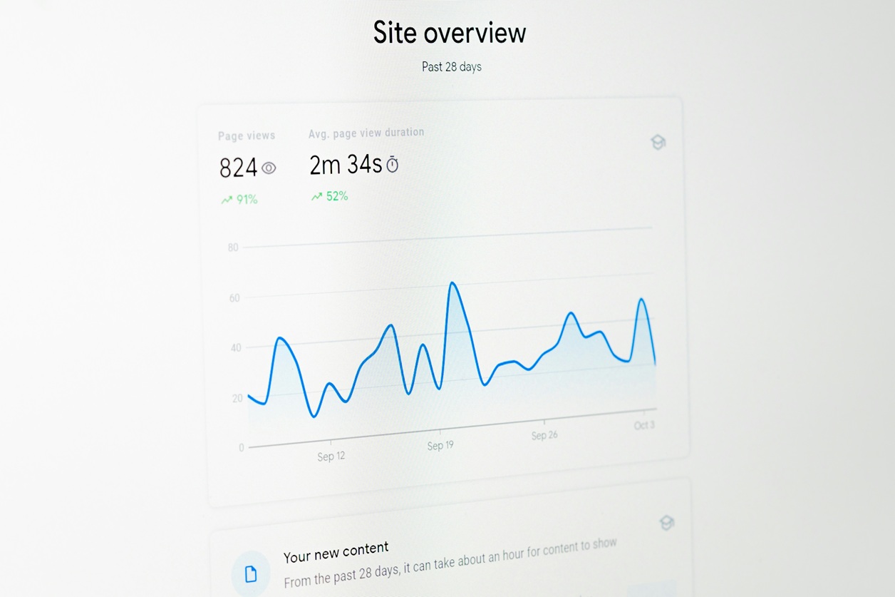
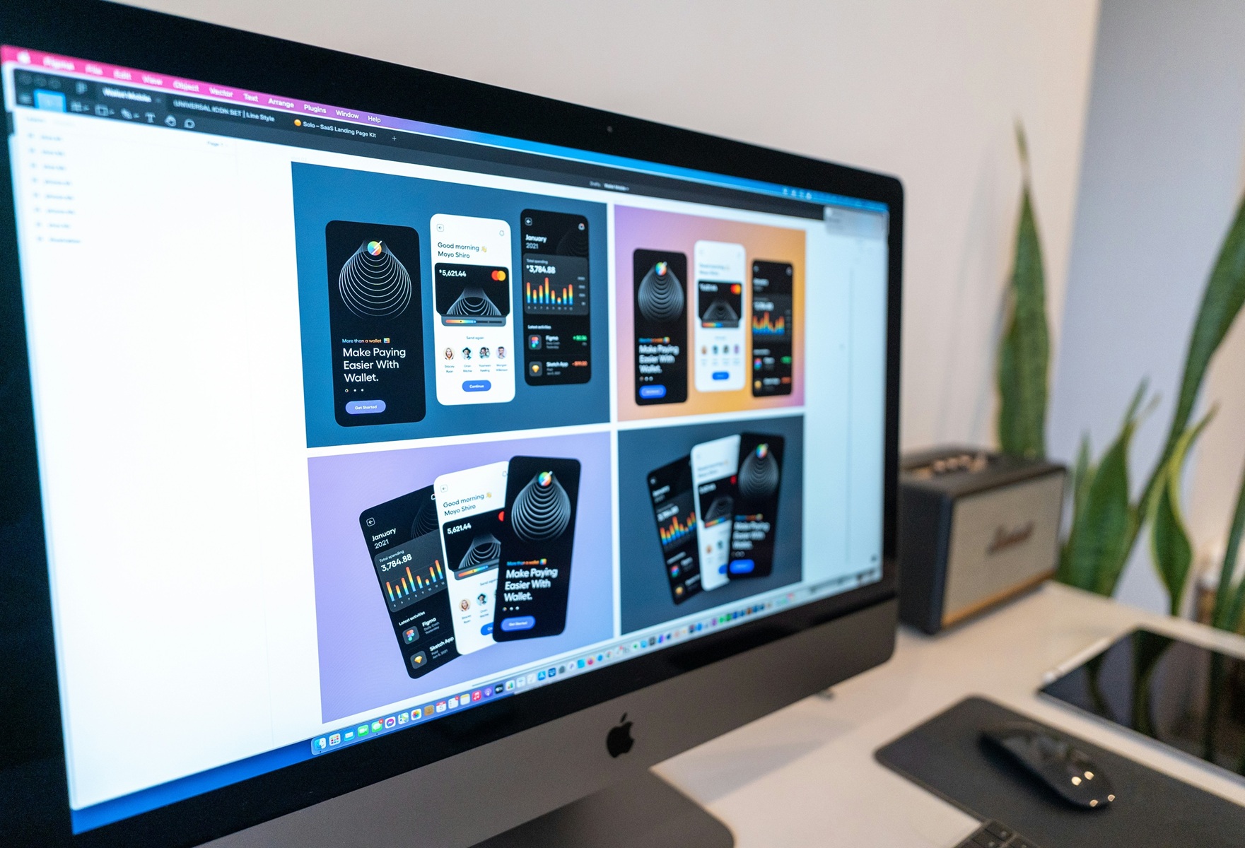
A website redesign is almost always perceived as a step forward. An updated interface, modern typography, and polished animations create a sense of progress and improvement. In practice, however, it is precisely after a redesign that companies increasingly face a drop in conversion, higher bounce rates, and deteriorating key metrics.
The problem is that redesign is treated as a visual improvement rather than an intervention in a working system. Familiar user journeys change, interaction logic breaks, and elements that quietly but consistently led users to the desired outcome disappear.
In this article, we examine why redesigns more often harm than help, what mistakes teams make, and how to approach a website update in a way that preserves - or increases - conversion.
Why Redesign Almost Always Breaks Conversion

Most redesigns begin with what seems like a valid motivation: the website looks outdated, visually loses to competitors, or no longer reflects the company’s current positioning. The problem is that the team almost immediately shifts the discussion to appearance - colors, fonts, grids, references - skipping the most important stage: understanding why the current site works at all.
Conversion rarely depends on a single element. It is formed by a chain of small, often non-obvious decisions: the order of sections, wording, button placement, and familiar interaction patterns. When a redesign is carried out “all at once,” without identifying and preserving these anchor points, the system stops being recognizable to the user. Even if the interface becomes objectively cleaner, the path to action is no longer read automatically.
An additional difficulty is that many conversion-driving elements look unimpressive. They may seem outdated, rough, or “non-designerly.” As a result, they are either removed or redesigned without understanding the function they performed. The user does not analyze these changes consciously - they simply begin to hesitate more often and act less frequently.
Midway through the process, another common mistake usually appears: redesign is substituted for solving business problems. Instead of answering the question “why the user does not reach the target action,” the team solves the task “how to make it look modern.” This creates an illusion of progress but does not affect the outcome.
A typical chain of problems during redesign looks like this:
- the current conversion rate and behavior scenarios are not documented;
- changes are introduced simultaneously across all key elements;
- decisions are made based on taste and subjective impressions;
- successful but inconspicuous elements are removed or simplified;
- the new version of the site is not tested incrementally and is launched all at once.
After launch, the team faces declining metrics and cannot understand where exactly the failure occurred. Rolling back is impossible because there are too many changes, and the link between decisions and results has been lost.
It is important to understand: redesign breaks conversion not because of “bad design,” but because it destroys the accumulated logic of user behavior. The site stops being a familiar tool and turns into a new object that has to be relearned. For part of the audience, this means extra effort - and any additional effort reduces the likelihood of action.
That is why redesign without analyzing the existing system is always a risk. It becomes controllable only when it is clear what must not be broken, even if it does not look ideal.
How to Approach a Redesign When the Site Is Already Working

When a website is already generating inquiries, sales, or leads, redesign stops being a creative task and becomes a risk-management task. At this point, the key question is not “how to improve,” but “what must not be broken.” Without a clear answer to this question, any update turns into an experiment on a live system.
The first mistake teams make is treating the current site as a “temporary solution.” Even if it looks outdated, it has already passed natural selection: users have learned how to use it, found the shortest paths to target actions, and adapted to the way information is presented. These habits are the site’s real value - not the visual layer.
A proper approach to redesign starts with documenting the current state. Not at the level of “it seems to be working fine,” but at the level of concrete scenarios: where users come from, what they see first, where they hesitate, and at what point they make a decision. Until this picture is assembled, any changes remain random.
An important distinction is separating “inconvenient for the team” from “inconvenient for the user.” Redesign is often initiated because of internal discomfort: the design feels wrong, the structure seems illogical, the site is embarrassing to show. But users do not experience these emotions. They either reach their goal or they do not. Everything else is secondary.
Midway through the work, it is useful to define baseline constraints that act as boundaries for the redesign rather than recommendations.
A minimum set of elements that should be defined before starting a redesign:
- key user scenarios that lead to conversion;
- elements that directly influence decision-making;
- points where users most often hesitate or drop off;
- metrics by which the results of changes will be evaluated;
- elements that must not be changed without testing.
This list does not speed up the work, but it makes it manageable. It helps separate acceptable changes from critical ones and reduces the risk that the redesign will affect the product’s foundation.
Another common mistake is trying to “improve everything at once.” When structure, copy, visuals, and interaction logic all change simultaneously, the team loses the ability to understand what exactly influenced the result. Even if metrics improve, that growth cannot be reproduced or scaled. If they drop, it becomes impossible to localize the problem.
A working redesign is always incremental. It allows imperfection at intermediate stages but preserves control. This contradicts the familiar expectation of “immediately beautiful,” but it aligns with the reality of digital products, where stability matters more than impression.
As a result, redesign stops being a one-time event and becomes a process. A process in which visual appearance is only the final layer, while the main work happens at the level of logic, scenarios, and user behavior. This is the approach that allows not just preserving conversion, but creating conditions for its growth.
When Redesign Actually Drives Growth

Redesign starts contributing to growth only in one case: when it solves specific user behavior problems rather than the abstract task of “making it better.” Unlike cosmetic updates, this kind of redesign rarely looks radically new, but it almost always changes the outcome.
Most often, growth appears where the original version of the site already handled the core task but ran into limitations: the user reached the right step but hesitated; understood the value but lacked confidence; saw the offer but did not understand why they should act now. At these points, design is merely a tool for strengthening logic, not a solution in itself.
A defining trait of a redesign that drives growth is that it starts not with layouts, but with hypotheses. The team formulates assumptions: what exactly is stopping the user, which element creates friction, what change could shorten the path or reduce doubt. Design is then used to test these hypotheses - not as an end in itself.
Importantly, growth is rarely achieved through a single “strong” screen. More often, it results from a series of small, almost invisible changes: simplifying wording, rearranging blocks, clarifying emphasis, improving hierarchy. Users do not consciously notice these adjustments, but they begin to orient themselves faster and act more confidently.
In practice, post-redesign growth most often comes from the following factors:
- reducing the number of decisions the user must make;
- eliminating ambiguous wording and visual conflicts;
- strengthening key arguments at moments of doubt;
- simplifying the path to the target action without losing meaning;
- alignment between content, structure, and visuals.
Crucially, these changes do not require a complete “reset” of the site. On the contrary, they build on an already working system and reinforce it. That is why growth-oriented redesign often looks less impressive in presentations, but performs better in metrics.
Another sign of a mature approach is the willingness to leave some elements unchanged. If a block, wording, or scenario works consistently, it does not need to be “improved” for the sake of visual consistency. Product coherence is defined not by a unified style, but by predictable user behavior.
In this sense, redesign stops being a visual event and becomes a controlled development tool. It does not guarantee growth automatically, but it creates conditions under which growth is possible and repeatable. This is fundamentally different from situations where results depend on luck and the team’s subjective taste.
Conclusion: Redesign as an Intervention in a System, Not a Change of Appearance
A website redesign is almost never a neutral action. It either strengthens an already working system or destroys it - even if the result looks cleaner and more modern on the surface. That is why redesign should not be treated as a purely design task or as a logical continuation of a brand’s visual evolution.
The core mistake lies in perceiving redesign as an improvement rather than as an intervention. What changes is not the visual layer, but user behavior: habits, expectations, ways of navigating and making decisions. When these changes are neither understood nor controlled, a drop in conversion becomes not an exception, but a predictable outcome.
A redesign that preserves or increases performance requires a different approach. It starts with understanding what already works, continues with testing hypotheses, and ends not with a final layout, but with stable results. In this process, design stops being the goal and becomes a tool.
In this sense, a successful redesign is not about bold visual solutions or following trends. It is about respect for the existing product logic and responsibility for every change. Everything else is just form - without value unless it delivers results.
