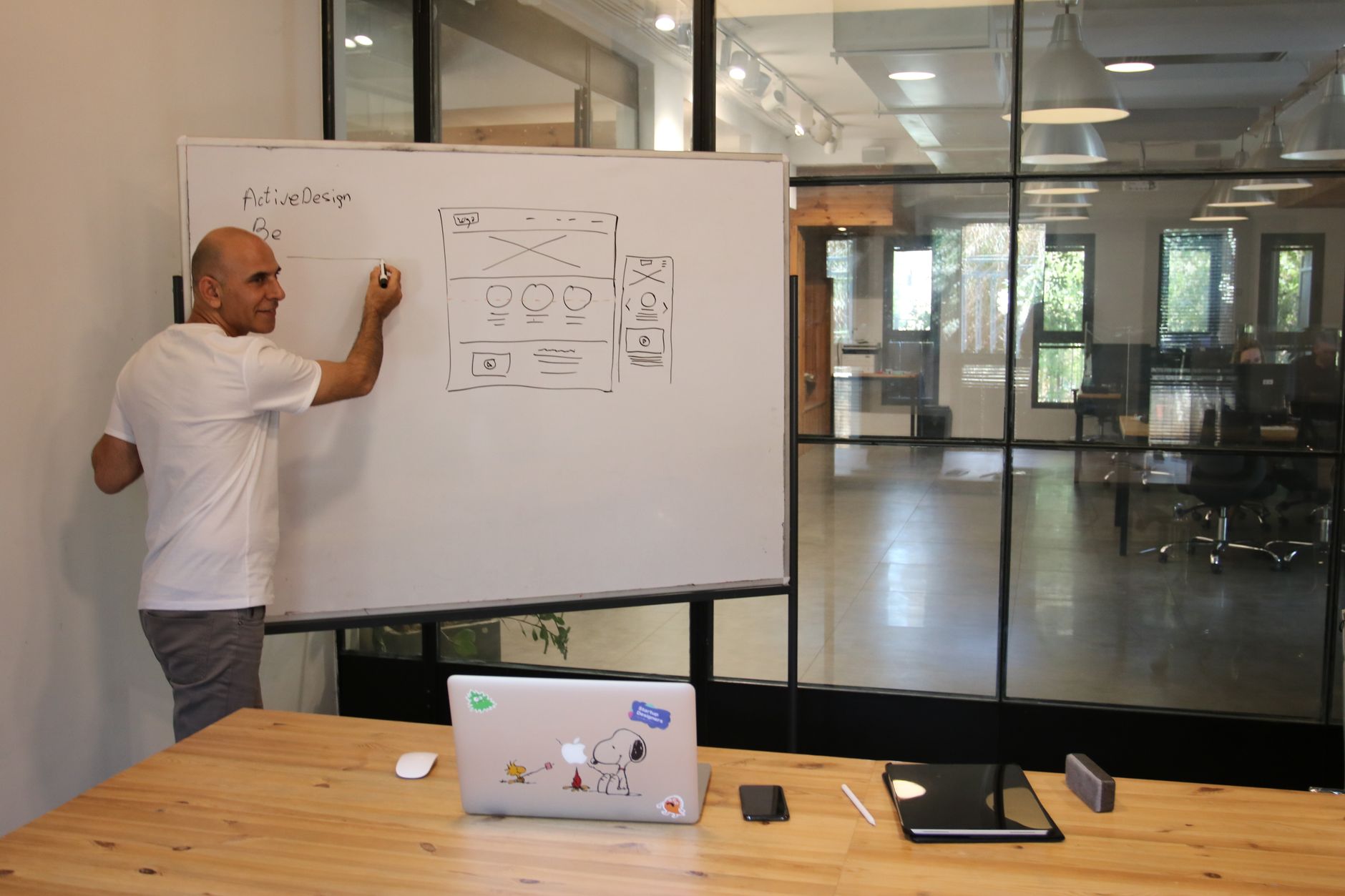
Building a responsive web application with Vue.js and Bootstrap is no longer a “nice to have”—it’s the baseline for product teams shipping to mixed device fleets, hybrid workforces, and always-on customer expectations in 2026. Users judge credibility and usability in seconds, and responsiveness is the first signal that your app is modern, cared for, and reliable.
The challenge isn’t just getting a grid to collapse on mobile. It’s coordinating component architecture, design consistency, accessibility, and performance so your UI stays fast and predictable as the app grows. This guide breaks down essential techniques to build responsive, maintainable Vue applications using Bootstrap—without turning your codebase into a pile of one-off CSS overrides.
Key Takeaways
- Choose the right integration path (Bootstrap CSS-only, BootstrapVue, or Bootstrap 5 JS modules) based on your Vue version, component needs, and long-term maintenance goals.
- Design responsiveness as a system: grid + spacing + typography + navigation patterns, not isolated breakpoints.
- Build a reusable Vue design system layer (wrappers, tokens, conventions) to prevent “utility soup” and inconsistent UI behaviors.
- Treat accessibility and performance as responsive requirements: keyboard, focus, reduced motion, and payload discipline.
- Use a checklist-driven workflow: responsive QA, component contracts, and regression-proof patterns for teams.
What’s the best way to combine Vue.js and Bootstrap for responsive UI?
The best approach is to pick an integration model that matches your stack and UI complexity: Bootstrap CSS-only for maximum control, BootstrapVue for Vue-friendly Bootstrap v4 components, or Bootstrap 5 with Vue for modern, jQuery-free behavior. Your choice should optimize for maintainability, accessibility, and predictable component reuse across screens.
Bootstrap and Vue complement each other: Bootstrap provides a mature responsive layout and styling system, while Vue provides reactive UI composition and state-driven rendering. If your team wants prebuilt Vue-flavored Bootstrap components, BootstrapVue offers a large library—described as “over 85 components, 45+ plugins, and 1200+ icons”—which can accelerate delivery for responsive, mobile-first interfaces.
If you’re targeting Bootstrap 5, it’s notable that Bootstrap 5 removed its jQuery dependency, making it a better fit for modern frameworks like Vue, as summarized in Bootstrap 5 and Vue.js: Building a Single Page Application. That shift reduces friction and helps keep your dependency graph cleaner when you only need a subset of interactive behaviors.
- CSS-only Bootstrap: import Bootstrap styles, use Vue components you design; best for custom design systems and long-term flexibility.
- BootstrapVue: use Bootstrap components as Vue components—SitePoint notes it “eliminat[es] the need for jQuery” by combining Bootstrap with Vue components (source).
- Bootstrap 5 JS modules + Vue: selectively use Bootstrap’s JS where needed (e.g., collapse, dropdown), but prefer Vue-driven state for UI control to avoid dual sources of truth.
How do you set up a responsive Vue project with Bootstrap (without future headaches)?
Start with a setup that keeps responsibilities clear: Bootstrap handles layout and baseline UI styles, while Vue owns rendering and state. Use a consistent import strategy, avoid global overrides early, and define a small set of project conventions (naming, spacing utilities, component wrappers) so responsiveness scales beyond the first few screens.
A practical baseline is to install Bootstrap CSS and then decide whether to add a component library layer. CoreUI’s guidance emphasizes that installing Bootstrap CSS (and optionally BootstrapVue) gives you the full styling system while keeping Vue’s reactive binding and component architecture intact (source). That’s the key: keep Vue “in charge” of UI state, even when you adopt Bootstrap conventions.
For teams delivering client work or multi-product portfolios, it can help to formalize a reusable starter aligned to your delivery model—for example, a shared UI kit and patterns supported by a product design and UI/UX service. If you’re standardizing on Vue for multiple apps, a dedicated Vue.js development capability page can also serve as an internal reference point for conventions and staffing.
- Define your responsive baseline: supported browsers, device classes, and accessibility requirements (keyboard, contrast, zoom).
- Choose integration: Bootstrap CSS-only, BootstrapVue (v4), or Bootstrap 5 modules; document the rationale.
- Set conventions: when to use utilities vs component-scoped styles, and how to name wrapper components (e.g., AppContainer, AppCard).
- Create a tokens file for spacing, breakpoints usage, and brand colors; avoid scattered hard-coded values.
- Add linting and formatting rules that prevent overly-specific selectors and enforce consistent class ordering.
What are the essential responsive layout techniques in Bootstrap for Vue apps?
Use Bootstrap’s grid, spacing utilities, and responsive helpers as a layout “contract,” then encapsulate repeated patterns into Vue components. Prioritize fluid containers, breakpoint-aware columns, and predictable spacing scales. The goal is to make layout changes safe and fast as screens evolve—without rewriting templates or adding fragile CSS.
In Vue templates, it’s easy to overuse utility classes until markup becomes hard to maintain. A better approach is to identify recurring layout structures—dashboards, forms, detail views—and standardize them. Think of Bootstrap’s grid as the primitive, and your Vue components as the product-specific system built on top.
Use container strategy intentionally
Choose between fixed-width containers and fluid containers based on content density and reading comfort. For data-heavy enterprise UI, a fluid container can reduce horizontal scrolling on mid-sized screens; for long-form content, fixed containers improve readability. Document where each is allowed so different squads don’t create inconsistent page widths.
Prefer breakpoint-driven composition over “magic CSS”
Let breakpoints drive component composition: hide secondary panels on small screens, move filters into off-canvas patterns, or collapse navigation. Bootstrap’s responsive display utilities can help, but avoid using them as a substitute for real information architecture. When behavior changes, keep the state in Vue so you don’t fight hidden DOM elements.
- Use grid columns to express intent (primary vs secondary content), not just to “make it fit.”
- Standardize spacing utilities (e.g., a small set of margin/padding patterns) to reduce visual drift.
- Use responsive typography and line length controls for readability on small screens.
- Avoid deep nesting of rows/cols unless you can justify it in a layout spec.
How should you structure Vue components to stay responsive and maintainable?
Structure Vue components around reusable layout and UI primitives: wrappers, cards, form groups, and navigation shells. Keep components small, state predictable, and styling either utility-based or scoped—but not both randomly. Responsiveness improves when your UI is built from consistent parts with clear props and slots.
A common failure mode is mixing layout responsibilities into every feature component. Instead, create a small set of “app frame” components (header, sidebar, content container) and keep feature components focused on data and interactions. This reduces regressions when you adjust breakpoints or navigation patterns later.
Adopt a wrapper-component pattern
Wrapper components encapsulate Bootstrap markup and classes behind a stable API. For example, an AppCard component can standardize padding, header actions, and responsive behavior while still allowing flexibility via slots. This keeps templates clean and ensures changes to spacing or borders happen in one place.
Use props and slots to express responsive intent
Expose props like size, density, or “stackOnMobile” to control layout in a semantic way. Slots let teams inject content without duplicating layout scaffolding. When you need conditional rendering for mobile vs desktop, prefer explicit component variants rather than scattered v-if conditions across multiple files.
- Define component contracts (props, events, slots) before styling details.
- Keep presentational components stateless when possible; push state upward.
- Avoid “CSS overrides” in feature components; fix styling at the primitive level.
- Write responsive behavior tests for critical components (navigation, tables, forms).
Which Bootstrap integration approach should you choose: CSS-only, BootstrapVue, or Bootstrap 5 modules?
Choose based on your constraints: CSS-only gives maximum control and modern Bootstrap 5 compatibility; BootstrapVue accelerates delivery with Vue-native components for Bootstrap v4; Bootstrap 5 modules work when you need a small set of interactive behaviors. The wrong choice usually shows up later as duplicate UI logic or upgrade friction.
If your team values speed and consistency and is aligned to Bootstrap v4 patterns, BootstrapVue can be compelling. The official BootstrapVue site positions it as a toolkit for building responsive, mobile-first projects with Vue and Bootstrap v4 and notes it includes “over 85 components, 45+ plugins, and 1200+ icons” (source). That breadth can reduce custom build time for standard UI.
If you’re building a new app and want to stay aligned with Bootstrap 5’s modern direction, the jQuery removal is an important architectural simplification. Reintech highlights that Bootstrap 5 removed its jQuery dependency, making it a strong fit for frameworks like Vue (source). In practice, that means fewer legacy dependencies and less risk of conflicting DOM manipulation patterns.
Comparison table: choose your path
Decision framework: use the simplest approach that meets your UI needs. If you mainly need layout and styling, CSS-only is often enough. If you need rapid access to a broad set of Vue-ready components for Bootstrap v4, BootstrapVue is attractive. If you need only a few interactive widgets, consider Bootstrap 5 modules but keep Vue as the state owner.
- CSS-only: Best for custom design systems; lowest lock-in; requires building your own component library.
- BootstrapVue: Fast UI assembly; Vue component wrappers; aligns to Bootstrap v4; confirm long-term maintenance fit for your stack (source).
- Bootstrap 5 modules: Modern Bootstrap; no jQuery dependency (source); still requires careful state management to avoid conflicts.
How do you build responsive navigation (header, sidebar, and mobile patterns) in Vue?
Build navigation responsively by separating structure from state: use Bootstrap’s layout and collapse patterns for visuals, but keep open/close state in Vue. Design for thumb-friendly mobile navigation, predictable focus behavior, and clear information hierarchy. Responsive navigation is often the highest-impact UI decision for usability.
Illustrative scenario (hypothetical): a B2B analytics app uses a left sidebar on desktop, but on mobile it becomes an off-canvas menu triggered from the top bar. The key is to keep route changes and menu state coordinated—close the menu on navigation, restore focus to the trigger, and avoid leaving hidden menus “active” for screen readers.
Pattern: responsive app shell
Define an AppShell component that owns layout: header, sidebar, and content area. Inside, render feature routes via a router view. This isolates responsive breakpoints to one place, so you don’t re-implement layout logic in every page component.
Avoid dual control of UI state
If Bootstrap JS is toggling a collapse while Vue also toggles it, you’ll eventually hit inconsistent UI. Pick one state owner—preferably Vue—and let the DOM reflect that state. If you use a Vue component library, it typically abstracts this for you; SitePoint notes Bootstrap-Vue eliminates the need for jQuery by exposing Bootstrap components as Vue components (source).
- Define navigation levels (global, section, page) and map them to components.
- On mobile, prioritize the top 3–5 actions; move secondary links into menus.
- Ensure focus management: open menu focuses first interactive element; close returns focus to trigger.
- Close menus on route change to prevent “stuck overlay” states.
- Support reduced motion preferences for transitions where possible.
How can you make forms responsive, usable, and accessible with Vue and Bootstrap?
Make forms responsive by optimizing layout for small screens, reducing cognitive load, and validating in real time without being disruptive. Use Bootstrap’s form layout patterns and Vue’s reactive validation to provide immediate feedback, while ensuring labels, help text, and error messages remain accessible and consistent across breakpoints.
Illustrative mini case (hypothetical): a procurement portal has a 20-field vendor onboarding form. On desktop, fields are grouped into two columns; on mobile, it becomes a single column with collapsible sections. Vue manages step state and validation, while Bootstrap ensures spacing and alignment stay consistent without custom CSS per field.
Use responsive grouping and progressive disclosure
On mobile, long forms feel longer. Group related fields into sections and reveal advanced options only when needed. Combine this with Vue-driven conditional rendering so hidden fields are not validated or announced by assistive technologies until they’re relevant.
Validation: immediate, but not aggressive
Use touched and dirty state to avoid showing errors before users interact. Show inline errors near fields, plus a summary at the top for long forms. Ensure error text is programmatically associated with inputs via aria attributes so screen readers announce it correctly.
- Labels should always be present (avoid placeholder-only labeling).
- Use consistent help text placement and spacing to reduce scanning effort.
- Keep tap targets large enough and avoid placing multiple small controls side-by-side on mobile.
- Prefer input types that trigger the right mobile keyboard (email, number) to reduce errors.
- Make submit states clear: disabled vs loading vs success, all driven by Vue state.
How do you handle responsive data tables and dense dashboards?
Responsive tables require more than horizontal scrolling. Use a strategy per table: prioritize columns, offer row expansion, provide card views on small screens, and keep sorting/filtering accessible. Vue should manage data state and rendering, while Bootstrap provides layout primitives for consistent spacing and alignment.
DigitalOcean’s BootstrapVue tutorial highlights that BootstrapVue offers components such as alerts and list views that can be made dynamic with Vue directives (source). The broader lesson applies to tables and dashboards too: use Vue to make UI elements dynamic (filters, empty states, loading states), and use Bootstrap patterns to keep layout predictable across devices.
Pattern: table-to-cards transformation
On small screens, consider rendering each row as a card with key fields visible and secondary fields tucked into a details section. This reduces horizontal scroll and improves readability. Keep the same data source and sorting rules; only the presentation changes based on breakpoint.
Pattern: column priority and row expansion
Define “must-have” columns that remain visible at all sizes, and move lower-priority columns into an expandable detail panel. Vue can drive expanded state per row, while Bootstrap handles spacing, borders, and responsive visibility classes. This pattern is especially effective for operational dashboards with many metrics.
- Define table goals: scanning, comparison, or record management; choose patterns accordingly.
- Provide a mobile-first filter UI (chips, off-canvas filters, or a dedicated filter screen).
- Make empty states and loading states explicit to prevent “blank screen” confusion.
- Keep actions accessible: avoid tiny icon-only buttons without labels or tooltips.
- Test with real data density; responsiveness often fails only with long strings and edge cases.
What performance techniques matter most for responsive Vue + Bootstrap apps?
Performance is part of responsiveness: if your UI shifts smoothly but loads slowly, users still experience it as “not responsive.” Focus on reducing CSS/JS payload, minimizing re-renders, lazy-loading routes and heavy components, and avoiding layout thrash. Use Vue for state-driven updates and keep Bootstrap usage modular.
Bootstrap can be lightweight or heavy depending on how you import and override it. Vue can also become slow if components re-render excessively due to broad reactive dependencies. Treat performance as a continuous practice: measure, optimize, and prevent regressions with budgets and CI checks.
Keep CSS and components modular
Import only what you need where your toolchain allows it, and avoid large global overrides that force the browser to evaluate complex selectors. Encapsulate custom styles within components or a small set of design tokens. When you must override Bootstrap, prefer variables and tokenized values over scattered custom rules.
Optimize rendering and interaction
Use computed properties to avoid repeated work and keep watchers targeted. Virtualize long lists when data sets are large, and debounce expensive operations like search-as-you-type. For responsive charts and dashboards, prefer resizing strategies that don’t trigger full re-layout on every minor viewport change.
- Lazy-load routes and heavy feature modules to improve initial load on mobile networks.
- Avoid shipping unused icons/assets; keep an explicit asset pipeline.
- Prefer CSS transitions for simple effects; avoid expensive JS-driven animations.
- Use skeleton loaders to communicate progress without layout jumps.
- Set performance budgets (bundle size, route load time) and enforce them in CI.
How do you ensure accessibility while building responsive interfaces?
Accessible responsiveness means your UI works across devices, input types, and assistive technologies. Ensure keyboard navigation, visible focus states, semantic markup, and predictable reading order at every breakpoint. Use Vue to manage focus and announcements during dynamic updates, and Bootstrap’s patterns to maintain consistent structure.
Responsiveness can accidentally break accessibility when elements are visually moved but not logically reordered, or when hidden content remains focusable. Treat breakpoint changes as functional changes: test with keyboard-only navigation and screen readers, and validate color contrast and text scaling.
Focus management and overlays
Off-canvas menus, modals, and dropdowns must trap focus appropriately and restore it on close. Vue is well-suited to manage this explicitly through refs and lifecycle hooks. Avoid relying on implicit DOM behavior that changes across browsers or breaks when components re-render.
Responsive content order and semantics
If you reorder content visually at different breakpoints, ensure the DOM order still makes sense for screen readers and keyboard navigation. Use semantic elements for landmarks and headings, and keep heading hierarchy consistent across views. This helps both accessibility and SEO/AEO comprehension.
- Verify visible focus indicators across all interactive elements (including custom buttons).
- Ensure interactive controls have accessible names (text, aria-label) and states (aria-expanded).
- Test zoom to 200% and large text settings; layouts should not break or hide essential actions.
- Avoid relying on color alone to convey status; pair with text or icons with labels.
- Confirm hidden elements are not tabbable and are properly removed from assistive tech when collapsed.
How do you manage theming and design consistency with Bootstrap in Vue?
Manage theming by defining a small set of tokens (colors, spacing, typography) and applying them consistently through Bootstrap variables and Vue wrapper components. Avoid ad-hoc overrides. A coherent theming strategy keeps responsiveness consistent, reduces CSS bloat, and makes UI changes predictable across the entire application.
Illustrative scenario (hypothetical): a SaaS platform rebrands and needs new primary/secondary colors plus updated button styles. If the app uses tokenized variables and wrapper components, the rebrand is a controlled update. If it relies on scattered class overrides, the rebrand becomes a brittle, screen-by-screen rewrite.
Use tokens and variables as your single source of truth
Define brand colors, spacing steps, and typography rules in one place, and map them to Bootstrap variables where possible. Then expose a minimal set of component variants (primary, secondary, danger, subtle) so teams don’t invent new styles. This is a governance issue as much as a technical one.
Create a component catalog for responsive QA
Maintain a living catalog (Storybook or an internal style guide) that shows components at multiple breakpoints and states: default, hover, focus, disabled, loading, error. This prevents regressions and makes it easier to onboard new developers. It also clarifies when to use Bootstrap utilities vs custom components.
- Standardize spacing rules (e.g., which padding classes are allowed in layouts).
- Define typography scale and apply it consistently across headings and body text.
- Limit component variants to a controlled set to prevent UI drift.
- Document responsive behavior per component (e.g., when buttons stack, when labels hide).
Practical examples: 5 responsive Vue + Bootstrap patterns you can reuse
Reusable patterns reduce design and engineering effort while improving consistency. The most effective responsive patterns combine Bootstrap’s layout primitives with Vue’s conditional rendering and state. The examples below are illustrative and meant to be adapted to your product’s information architecture, accessibility needs, and performance constraints.
Example 1 (hypothetical): responsive dashboard cards with prioritized content
A sales dashboard shows KPIs in cards. On desktop, cards appear in a multi-column grid with small sparklines; on mobile, cards become a single column with only the top KPI and a “details” toggle. Vue controls which metrics render per breakpoint, while Bootstrap ensures consistent alignment and spacing.
Example 2 (hypothetical): filterable list with off-canvas filters on mobile
A directory page uses a left filter panel on desktop. On mobile, filters move into an off-canvas panel with an “Apply” button and a count of matching results. Vue manages filter state and the applied vs draft filters, preventing re-fetch on every tap and keeping UX smooth on slower devices.
Example 3 (hypothetical): responsive authentication screens with consistent spacing
Login, password reset, and MFA screens often drift visually. Create an AuthLayout wrapper that sets a consistent max width, vertical rhythm, and button stack rules. Bootstrap utilities handle spacing, while Vue handles validation and error states. The result is a consistent, accessible flow across devices.
Example 4 (hypothetical): table-to-cards for mobile incident management
An incident list is a table on desktop with columns for severity, owner, and SLA. On mobile, each incident becomes a card with severity and title visible, and SLA/owner inside a collapsible section. Vue drives expansion state and status badges; Bootstrap provides consistent card layout and responsive spacing.
Example 5 (hypothetical): responsive modal workflow for approvals
An approval workflow uses a modal on desktop, but on mobile it becomes a full-screen panel to avoid cramped forms. Vue controls the workflow state (steps, validation), while Bootstrap styles the layout. Focus trapping and “return focus to trigger” behavior are treated as first-class requirements.
Common pitfalls (and how to avoid them) when building responsive Vue + Bootstrap apps
Most responsiveness failures come from inconsistent patterns and competing sources of truth: Bootstrap JS vs Vue state, scattered CSS overrides, and components that mix layout with business logic. Avoid these by standardizing patterns, encapsulating Bootstrap markup, and testing responsiveness as a product requirement—not a final polish step.
A frequent anti-pattern is “utility sprawl,” where templates become unreadable and changes become risky. Another is relying on hidden elements rather than designing mobile-first interactions. Finally, teams often under-test real data: long names, localization, and edge-case statuses can break responsive layouts quickly.
- Pitfall: Vue and Bootstrap both toggling UI state. Fix: keep state in Vue; use Bootstrap for styling and structure.
- Pitfall: ad-hoc CSS overrides per page. Fix: introduce wrapper components and tokens; centralize overrides.
- Pitfall: responsive design tested only in dev tools. Fix: test on real devices and with keyboard/screen reader flows.
- Pitfall: tables that only scroll horizontally. Fix: apply a table-to-cards or priority-columns strategy.
- Pitfall: inconsistent spacing and typography. Fix: define a small spacing scale and enforce it in code review.
If you’re modernizing an existing UI, treat responsiveness as part of a broader platform upgrade. A practical companion for system modernization planning is migrating legacy systems to modern frameworks, which can help you sequence UI, architecture, and delivery changes without disrupting the business.
Actionable next steps: implementation checklist for a responsive Vue + Bootstrap app
Use this checklist to move from “responsive pages” to a responsive application system. The goal is repeatability: every new feature should inherit the same layout rules, accessibility behaviors, and performance expectations. Treat this as an engineering and product workflow artifact, not just a one-time setup task.
- Integration choice: document whether you use Bootstrap CSS-only, BootstrapVue (Bootstrap v4), or Bootstrap 5 modules; include upgrade considerations and ownership rules for UI state.
- App shell: implement a responsive AppShell with header/sidebar/off-canvas patterns; ensure menu state is Vue-owned and closes on route changes.
- Design tokens: define colors, typography, and spacing tokens; map them to Bootstrap variables or a controlled utility strategy.
- Wrapper components: build 8–12 primitives (AppContainer, AppCard, AppButton, AppFormGroup, AppModal, AppTableShell, AppEmptyState, AppSpinner) with consistent props/slots.
- Forms: standardize validation patterns (touched/dirty), error message placement, and mobile-first grouping; test at multiple breakpoints.
- Tables/dashboards: define a mobile strategy (cards, column priority, row expansion); ensure actions remain accessible.
- Accessibility QA: keyboard navigation, focus states, aria attributes for expandable controls, zoom/text scaling, reduced motion checks.
- Performance budgets: lazy-load routes, avoid unused assets, set bundle/per-route budgets, and add regression checks in CI.
- Responsive testing: create a device matrix and test scripts; include real-content edge cases (long strings, localization, empty states).
- Governance: add code review rules for utilities vs component styles, and maintain a component catalog for responsive states.
If your responsive UI work is part of a broader platform roadmap—such as integrating content, personalization, or multi-channel delivery—pair this implementation plan with headless CMS integration in 2026 to keep UI architecture aligned with content operations and scaling needs.